Let us make an in-depth study of the distribution of income and social welfare function.
Pareto optimality for exchange is represented by a point on the contract curve.
But there are an infinite numbers of points on the contract curve, and any one of them is Pareto optimal point.
The point that is actually reached is largely determined by the initial distribution of income, which we assume as given.
ADVERTISEMENTS:
If the initial distribution is changed, then the Pareto optimal point could also change.
This raises the question of whether the Pareto optimal points reached under some given distribution of income, yields the maximum social welfare when compared with other distributors of income? For example, a Pareto optimal point could be reached with a large number of population below poverty level and a redistribution of income might increase social welfare.
The social welfare function deals with the problem of income distribution. This function expresses social preferences concerning the different patterns of social organisations and it also represents the judgment of the society with respect to the ordering of the different configurations of total satisfaction to be derived from different distributions of income.
This value judgment could be reached by a direct voting system or by any other means.
ADVERTISEMENTS:
Individuals expressing their evaluation of different social organizations might consider not only the distribution of income, but also their attitudes and feelings about the value of education, hospital care and other non-economic variables. Now we show how a social welfare function can be used to determine the distribution of inputs and goods which will maximise social welfare.
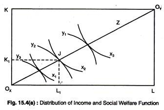
We know that for every point on the contract curve for production, there is a corresponding point on the transformation curve. This relationship is shown in Fig. 15.4 for a 2 x 2 x 2 x 2 economy.
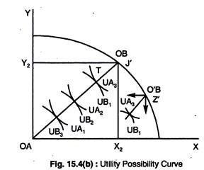
We start by arbitrarily selecting a point, say J, on the contract curve in Fig. 15.4(a). Point J shows that a labour input of L1 and a capital input of K1 will produce X2 of good X and Y2 of good Y. Point J’ on the transformation curve in Fig. 15.4(b) represents the same amount of X and Y as in Fig. 15.4(a).
ADVERTISEMENTS:
Since X2 and Y2 are the total quantities of X and Y available for consumption in the economy, an exchange box diagram can be inserted within the transformation curve with consumer A’s origin OA corresponding to the origin of the transformation curve and consumer B’s origin OB at point J’.
Every point on the contract curve from OA to OB denotes a different Pareto-optimal distribution between A and B. As we move away from A’s origin, this denotes that he is receiving more X and Y, and, thus, enjoying more satisfaction and since, in the process, B is moving closer to his origin, his satisfaction is declining.
The next step involves the derivation of a utility possibility curve. This curve shows the amount of utility obtained by A and B respectively, at each point on the contract curve in Fig. 15.4(b). For example, point Tin Fig. 15.4(b) represents a utility level of UA3 for A and UB1 for B.
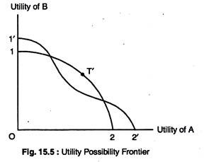
These utility levels are plotted as point T in Fig. 15.5. Thus, the utility possibility curve corresponding to the contract curve in Fig. 15.4(b) is traced in Fig. 15.5.
The curve shows that A gains utility as B loses utility. We now start from Fig. 15.4(a) and repeat the steps that we took to derive the utility possibility curve, but we select a different point on the production contract curve. We take point Z which is translated into point Z’ on the transformation curve in Fig. 15.4(b).
Again, we insert an exchange box diagram at point Z’ in Fig. 15.4(b). The contract curve from point 1′ to point 2′ yields the utility possibility curve from 1′ to 2′ in Fig. 15.5. By taking the outermost edges of all possible utility possibility curves, the utility possibility frontier is drawn; this is shown in Fig. 15.5.
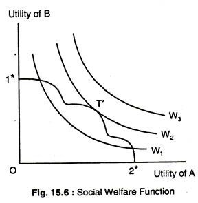
We now turn to social welfare function, which is given in Fig. 15.6 by the family of curves W1, W2, W3, Each curve represents combinations of A’s and B’s utility that yield the same aggregate level of social welfare. A higher curve depicts a higher level of social welfare. These curves are, in fact, social indifference curves. The utility possibility frontier is incorporated in Fig. 15.6 as from 1* and 2* and it gives all the optimal utility combinations that are possible for A and B.
ADVERTISEMENTS:
The highest attainable level of social welfare is reached where the utility possibility frontier is tangent to a social indifference curve at T is Fig. 15.6. The movement to the left or the right of point T along the utility possibility frontier would be a movement to a lower level of social welfare, and points outside the frontier are unattainable.
Thus, point T represents maximum social welfare, given the input and technological constrains of the system. The problem of the distribution of income has been solved.
It should be emphasized that the tangency point of the utility possibility frontier W0 and T’ in Fig. 15.6 was selected merely to simplify the presentation.
ADVERTISEMENTS:
This tangency could occur at any point of the utility possibility frontier, depending on the shapes of the social indifference curves, in which case, the corresponding points on the exchange contract curve, the transformation curve and the production contract curve would have been different.
It should be noted that the existence of social welfare function does not change the marginal conditions of Pareto optimality, nor does it alter the role of perfect competition in satisfying these conditions, given large numbers of consumers, producers, goods and inputs.


