
The upcoming discussion will update you about the functional relationship between the quantity supplied and price.
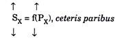
where SX is the supply of good X and PX is the price of good X. There exists a direct or positive relationship between price and quantity supplied. The law of supply states that, ceteris paribus, as the price of a commodity rises (falls) its supply rises (falls). When this price- quantity relationship is plotted on a graph we get a supply curve that slopes upwards.
Thus the law of supply can be explained by drawing a supply curve for a commodity. To do this, we now illustrate the relationship between price and quantity supplied with the following hypothetical data for a producer of good X. The data can be presented either in the form of a schedule or a graph. Table 4.3 shows the supply schedule of good X.

The supply schedule shows the relationship between the quantity supplied and the price. It is a numerical tabulation that lists some prices and shows the quantity that will be offered for sale at each price. The supply schedule as shown here suggests that nothing would be offered for sale when price is Rs. 4 per kg.
If price rises to Rs. 8 per kg, 3 kgs will be supplied, if price rises to Rs. 12, 6 kgs will be supplied, and so forth. Each price- quantity combination is shown by a reference letter as t, u, v, etc. for the sake of convenience.
The data presented in Table 4.3 can be presented in the form of a graph as in Fig. 4.11. Both Table 4.3 and the Fig. 4.11 give the same information. In fact, Fig. 4.11 is a graphical representation of the Table 4.3. Note that a supply curve is a graph of the supply schedule.

The supply curve does not start from the origin. It starts from point ‘t’. In other words, the supply curve has positive intercept. It cuts the vertical axis at a positive price. The implication is that there must exist a positive price for any quantity of a commodity to be offered at all. If price is less than this nothing will be offered for sale.
ADVERTISEMENTS:
In this context, Alfred Marshall referred to the reservation price of a commodity. In Fig. 4.11, a price greater than Rs. 4 per kg is essential to produce and offer any output of X. If price were less than Rs. 4 per kg the minimum cost per unit could not be covered and output (quantity supplied) would be zero.
The smooth line through points to z is the producer’s supply curve. Like the demand curve, it is also the locus of alternative price- quantity combinations. It shows the different quantities offered for sale at seven different prices as also at all intermediate prices.
For example, from Fig. 4.11 we can find out how much will be offered for sale at a price of Rs. 22 per kg. All we have to do is to locate the price on the vertical axis, draw a horizontal line from this point and then draw a perpendicular from that point. This point here indicates that when price is Rs. 22 per kg, the quantity offered for sale is 13.5 kgs.
ADVERTISEMENTS:
Note that the supply curve for good X is upward rising because supply of the commodity rises when its price rises. Conversely, a firm will supply less of a commodity in the market when its price falls. Thus there is a direct price-quantity relationship. So, the of supply curve a commodity must be positive sloping.