
The below mentioned article provides an overview on the Law of Demand for a Commodity. After reading this article you will learn about: 1. Introduction to the Law of Demand 2. Illustrating the Law of Demand 3. Demand Schedule and the Market Demand Curve.
Introduction to the Law of Demand:
Demand for a commodity always depends on the price of that commodity. Demand has no meaning unless it is related to time. Thus, demand for anything at a given price is the amount of it which will be bought per unit of time at that price.
The law of demand establishes the functional relationship between the price of a commodity and the quantity demanded for it. Other things remaining the same, i.e., ceteris paribus (such as, constancy in money income of the consumer, price of related goods, etc.), a consumer will demand more of a commodity if its price falls, or vice versa.
Thus, the law of demand establishes an inverse relationship between the demand for a commodity and its price.
ADVERTISEMENTS:
This demand function is usually expressed in terms of the following equation:
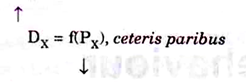
This function, presented in the language of mathematics, states that the demand for good X is only a function of the price (P) of good X. As PX↓ DX↑ or as PXT DX↓.
Besides own price, demand for a commodity depends on many other factors. Thus, when we examine the relationship between price and the quantity demanded for a commodity we assume that all other determinants of quantity demanded (stated above) remain unchanged.
ADVERTISEMENTS:
Holding all these constant is known as the ceteris paribus assumption, implying that ‘other things being equal’. We then vary the price of X and study how it affects the quantity of X demanded, ceteris paribus. Thereafter, we hold the price constant and vary other variables one by one (i.e., one at a time).
This enables us to understand the importance of each variable on demand. After doing this, we can aggregate the individual influences of two or more variables to find out what would happen if two, three or more variables affecting demand change at a time—as is seen in reality.
Illustrating the Law of Demand:
If we hold all other variables that influence the demand for a commodity constant, the quantity demanded for a commodity will vary inversely with its price (sacrifice). This relation holds true in case of almost all the commodities that we buy. This is known as the law of demand. This is shown by the arrow-heads given in demand equation. This can be read as PX↑ DX ↓ or as PX ↓ DX↑.
Table 2.1 illustrates the law of demand. It shows the relation between price and the quantity demand of a particular commodity, say, X. Column (i) in Table 2.1 shows the different quantities of X that a hypothetical consumer, say, Mr. A, would be ready to buy at five different prices.

This table is known as the demand schedule. The demand schedule for a commodity of an individual is a catalogue of different amounts of the commodity that he will buy at different prices. It is a table of prices and the corresponding quantities demanded for a good.
It shows, for example, that at a price of Rs. 3.00 per kg, his quantity demanded is 8 kgs per week; at a price of Rs. 2.00 his quantity demanded is 12 kgs per week, and so forth. Each price-quantity combination is indicated by a reference point such as a, b…. etc. This schedule establishes an inverse relationship between price and the demand for X.
We can easily present the data of Table 2.1 in the form of a graph. This is done in Fig. 2.1, where we measure price on the vertical axis and quantity on the horizontal axis.

Point ‘a’ shows that when price is Rs. 3.50 the quantity demanded is 6 kgs. Point ‘b’ shows that when price is Rs. 3.00 the quantity demanded is 8 kgs. Other points represent three other price-quantity combinations (originally shown in Table 2.1).
Picturisation of the demand schedule gives us a demand curve. A demand curve is thus a graph of the demand schedule. By connecting all the points we get a continuous line. This may be called the demand line for X of Mr. A, represented by DA in Fig. 2.1. The demand schedule is specific in nature because it shows only five possible combinations of price and quantity.
The demand curve, on the other hand, is more general in nature because it shows not only these five but various other possible combinations of price and quantity as well. In other words, the demand curve shows various other quantities of X that will be demanded by Mr. A at various other prices, i.e., at all intermediate prices.
For example, with the aid of the demand curve we can find out how much of X will be demanded at a price of Rs. 1.75. In order to find it out we have to locate the price Rs. 1.75 on the vertical axis and find out a point which corresponds to this price on the demand curve. We then draw a perpendicular line from that point to find the associated quantity at that price.
It is possible to do this for any price. For example, when price is Rs. 1.75 the quantity demanded is 14 kgs per week. The demand curve describes the complete relationship between the price of a commodity and the quantity demanded of the same. It is a graph that shows the quantity one buyer will buy at every possible price.
ADVERTISEMENTS:
The demand curve in Fig. 2.1 illustrates the law of demand which states that the quantity demanded for a commodity increases when its price falls… The converse is also true—the quantity demanded falls when price rises. Thus, there is a negative (inverse) relation between price and quantity. They move in opposite directions. If one (price) increases the other (demand) falls.
Demand Schedule and the Market Demand Curve:
To arrive at the market demand, we add together the demands of all individual consumers. For the purpose of illustration, let us take a simple case where there are only two consumers—Mr. A and Mr. B. Table 2.2 is a market demand schedule. The information given in this table is plotted on Fig. 2.2 which shows the market demand curve. This is derived by adding up the two demand curves, i.e., of A and of B, shown separately.

We may first deal with the market demand schedule. This is obtained by adding the quantity demanded of Mr. A and Mr. B at each price. We thus arrive at a total quantity demanded in column (iv). At a price, say Rs. 4 per kg, both Mr. A and Mr. B demand the same quantity. Anyway, both the individuals demand less (more) when price is high (low).
ADVERTISEMENTS:
Thus, like individual demand schedules, market demand schedule exhibits an inverse relationship between price and quantity demanded. It is to be kept in mind that to derive the market demand schedule, we add horizontally all the individual demand schedules.
Market Demand Curve:
The market demand curve for X, shown in Fig. 2.2, is constructed by plotting the market demand schedules in column (iv) of Table 2.2. In fact, it is derived by adding horizontally the demand curves of the two (representative) buyers. Look at Fig. 2.2.

By taking a common price on each curve, and adding the corresponding quantities, we find the total quantity demanded at each price. For example, at a price of Rs. 40 per kg, the figure tells us that Mr. A will demand 10 kgs, and Mr. B will also demand 10 kgs.
ADVERTISEMENTS:
This makes a total of 20 kgs which is plotted as the total market demand associated with a price of Rs. 4 per kg. Thus, the market demand curve is derived by adding up horizontally the demand curves of individual consumers. Like the individual demand curve, market demand curve is also negatively sloped.
In theory, we draw the market demand curve by horizontally adding up the demand curves of individual consumers. But, in practice, we rarely obtain market demand curves by summing up the demand curves of millions of individual consumers. Instead, we form an idea about the market demand by observing total quantities directly.