Let us make an in-depth study of the graphical representation of statistical data.
Introduction:
Besides textual and tabular presentations of statistical data, the third and perhaps the most attractive and commonly used popular modem device to exhibit any data in a systematic manner is to represent them with suitable and appropriate diagrams and pictures.
The usual and effective means in this context are: graphs, charts, pictures, etc. and they are really and surely capable of depicting some important features of the data which they individually are not able to exhibit. Selection of the appropriate diagram actually depends on the nature of the raw data available and the purpose or the area in which it will be applied. However, only certain limited information can be supplied through a particular diagram and as such each diagram has certain specific limitations of its own.
A few commonly used diagrams applied on different occasions in various disciplines today are the line diagram, bar diagram, ogive, pie diagram and the pictogram (as prescribed in the syllabus).
ADVERTISEMENTS:
It may be noted that diagrammatic representations of statistical information is appealing to the eyes. Hidden facts may also be detected once such information are presented graphically. Further, graphs of statistical data clearly bring out the relative importance of different figures, the trend or tendency of the values of the variables involved can be studied too.
Line Diagrams:
This kind of a diagram becomes suitable for representing data supplied chronologically in an ascending or descending order. Usually, it shows the behaviour of a variable over time. Successive values of a variable at different periods or places are plotted as separate points on a two dimensional plane and the locus of all those points joined together form a continuous line segment, called line diagram.
While tracing out such a diagram, the usual convention is to show the successive values of the variable under study along the vertical axis in an increasing order and the time dimension along the horizontal axis. It should carefully be noted that none of the two axes be too long or too short with respect to each other.
This is very much necessary mainly to avoid unpredictable and wide fluctuations in the given values of the variable. The origin or the (0, 0) point at the left hand comer should clearly be mentioned so as to discard wrong impression on the process of drawing.
ADVERTISEMENTS:
Two or more (but finite number of) line segments can also be drawn on the same quadrant when information on different variables over the same period or time are simultaneously represented using the same unit of measurement along the same axis. We can thus draw a number of line- diagrams for different data series on the same quadrant.
They can distinctly and attractively be displayed on a screen for presentation with various colourful lines. When the values of the variable under consideration change at a constant rate over the same successive time intervals, the diagram will take the shape of a straight line. Other-wise, it will represent various concave, convex or irregular curves when viewed from the origin.
Let us now represent a common line diagram below:
Example:
ADVERTISEMENTS:
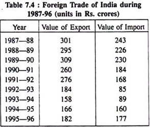
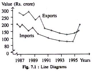
Line diagrams showing total values of Exports and Imports during 1987-96 have been presented in Fig. 7.1. This figure has been drawn on the basis of data shown in Table 7.4.
Two separate line diagrams showing fluctuations in the values of exports and imports of India during (1987—96) are shown below:
In the diagram drawn above the successive years from the table are shown horizontally and the corresponding values of export and import are shown vertically and the points are located separately on the plane from the middle of the respective years and the lacus of those points exhibit the trend along the line diagrams.
Bar Diagrams:
It is another well-known useful statistical weapon to represent raw data decently. This device is applied specially in a situation where the given data can be classified on the basis of a non- measurable criterion e.g., standards of college education in different states of India at the present time.
This is very often called cross-section data. More precisely, a bar graph is formed as a collection of rectangles having the same width or breadth placed successively at equal distance. Practically, the height of each bar placed vertically represents the value of the variable on the identical class interval shown horizontally.
Usually, these bars are placed either vertically on the horizontal axis or horizontally on the vertical axis and they are thus known as vertical bar chart or horizontal bar chart. Conventionally vertical bar charts are formed with the time series data.
Actually speaking, no formal rule as to how much space to be given in between the two bars is there. If necessary, no space in between two bars can be given. In some other cases, suitable and reasonable gaps in-between two bars may also be allowed.
ADVERTISEMENTS:
Let us imprint simple and suitable examples of bar diagrams below:
(a) Simple Vertical Bar Diagram:
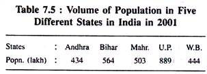
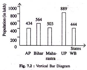
Volume of population in a number of states in India in 2001 is given below—represents the data with the aid of vertical bars.
Fig. 7.2 Shows population of a number of 5 States in India in a particular year (2001):
ADVERTISEMENTS:
(b) Horizontal Bar Diagram:
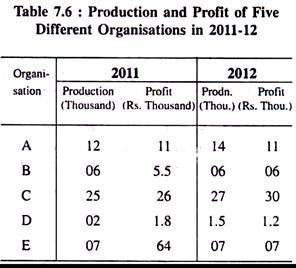
Volume of production and profit of five different organisations operating under a particular industry with separate productive capacities are given below for the two successive years 2011 and 2012.
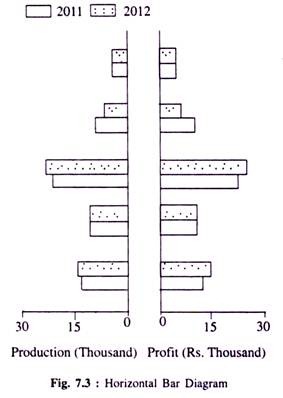
We represent the information through an ideal bar diagram. Here Fig. 7.3 is drawn below on the basis of Table 7.6. We have chosen this horizontal bar diagram to facilitate comparison of performances of 5 organisations for the years 2011 and 2012, respectively.
ADVERTISEMENTS:
Horizontal bars show production (in thousands) and profit (Rs. thousand) of five organisations of India in the financial year 2011-12.
(c) Multiple or Component Bar Diagram
These diagrams are used in a situation where two or more related categories are to be compared simultaneously.
Consider the following example:
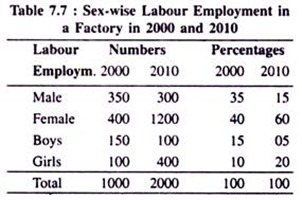
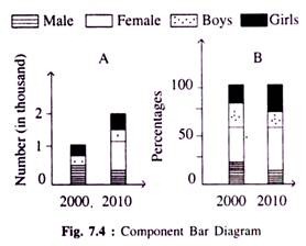
Labour employment and their percentages in 2000 and 2010 in a factory is given below. Represent them in terms of multiple or component bar diagrams.
ADVERTISEMENTS:
Component bar diagrams show number of labourers of different categories and their respective percentages for the years 2000 and 2010.
Pie Diagram:
It is another effective statistical device to represent quantitative data obtainable on many occasions simply and diagrammatically. When the various parts of the values of a variable possesses different properties then to express the inherent relationship among them and also with the aggregate value of the variable, pie diagram possibly is the best device.
Here, the aggregate value of the variable is expressed as the total area of a circle with a reasonable radius. The entire area in the circle is subdivided into a number of parts by several radii which are separately related to the total area of the circle and also maintain the same proportional relation with the angle at the centre.
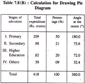
For drawing it correctly, we convert the particular given values of the variable as a percentage of the total value of the variable. As the angle at the centre is 360°, it is supposed to express 100 p.c. value of the variable where 1 p.c. value of the variable is equivalent to an angle of 3.6° at the centre.
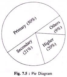
We can thus easily convert the individual given values of the variable into the required angles at the centre. Then we draw a complete circle taking any standard radius and put the angles found from the numerical exercise separately at the centre. Each separate part in the circle signifies a particular section of the data. Let us represent a simple pie diagram below constructed with the usual method prescribed and followed for its computation by converting the following information into that diagram.
ADVERTISEMENTS:
Example:
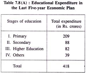
Expenditure incurred by the Planning Commission of India on Education in the last 5-year economic plan.
Table 7.8(A): Educational Expenditure in the Last Five-year Economic Plan:
Let us first convert the given data into respective percentages and then into the required angles to be shown at the centre in two more columns and represent them in the following way:
Here, angle at the Centre = Percentage x 3.6.
ADVERTISEMENTS:
Pie diagram drawn below on the basis of Table 7.8 (B) shows expenditure on education at various stages in the last 5-year economic plan.
Ogive or Cumulative Frequency Polygon:
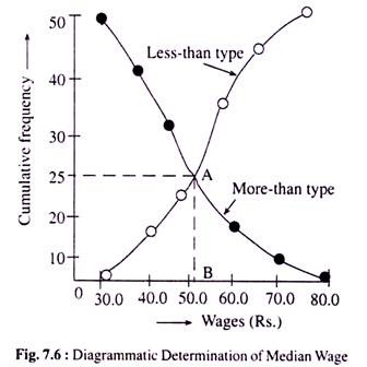
An ogive is another statistical tool primarily used for finding out different quartiles in a distribution. From such a device we can also identify the number of observations lying above or below a certain value of the concerned variable.
This kind of a diagram is drawn for a frequency distribution of a continuous variable in terms of cumulative frequencies of both the types (more than or less than type). While drawing this diagram we consider the given values of the variable horizontally and the corresponding cumulative frequencies (of either type) vertically.
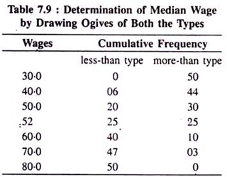
Cumulative frequency of less than type is zero for the lowest given value of the variable and similarly cumulative frequency of greater than type is zero for the highest value of the variable considered. Using the data available from a production organisation, Ogives of both the types are drawn below for our ready reference.
Ogives (of both the types) drawn on the basis of the above data and determination of the median wage:
Here, being the middle-most value of the given wage rates, the median wage is found OB (= Rs. 52) because only at this wage rate the two cumulative frequency curves intersect at point A representing two cumulative frequencies (less-than and greater-than) of both the types exactly equal (AB = 25) with each other. Hence, the median wage is OB = Rs. 52.00.
