Production Possibility Curve: Features, Schedule Representation and Assumptions!
The economic problem of scarcity and choice can be easily and clearly explained with production possibility frontier or curve.
Production possibility curve or production frontier refers graphically to all the possible combinations of maximum amounts of two goods which can be produced with the available productive resources of an economy.
In short, production possibility curve is a curve which shows all possible combinations of two goods that can be produced by making full use of given resources and technology in an economy.
ADVERTISEMENTS:
We know that an economy always faces the problem of resource allocation i.e. making a choice of its resources. Again there is a maximum limit to the quantity of goods and services which an economy can produce with full use of its available resources and technology. We also know that an increase in the production of one commodity reduces the production of other commodity. In this way available resources can be used alternatively to produce different combinations of goods and services. This is known as production possibility. The curve that shows these alternatives is called production possibility curve.
Schedule Representation:
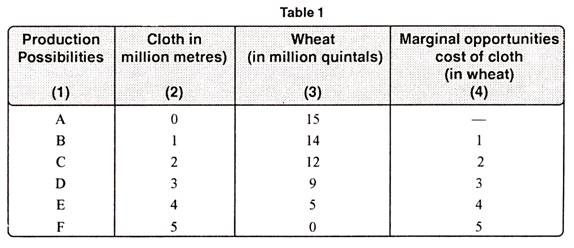
Let us assume that two commodities are to be produced say, cloth and wheat. If all the resources are put to produce cloth, then the maximum of cloth will be produced per year, depending on the quantitative and qualitative resources and the technological efficiency. Let us, now further suppose that within the existing conditions only 5 million meters of cloth can be produced, with all the resources at our command.
Alternatively, if all the resources are used for the production of wheat, we can produce 15 million tonnes of food grains. In between these two extreme possibilities, there are many other alternatives. Thus we shall have to scarcities one for the other. This fact is clear from the Table No. 1.
Diagramme Representation:
ADVERTISEMENTS:
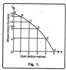
With the help of above table, we can show production possibility curve in respect of cloth and wheat. Economy can produce maximum 5 million metres of cloth or 15 million quintals of wheat. In Fig. 1, on OX axis, we have measured cloth in million metres while on OY axis; we have taken wheat in million quintals.
The concave curve AF shows the join of various possible combinations which gives a curve known as transformation curve or production possibility frontier. Each production possibility curve is the locus of output combination which is obtained from given factors or inputs. Similarly B, C, D and E show the different combinations for two different goods i.e. cloth and wheat. The economy has to choose out of these various combinations, which can be produced by existing resources and technology. They are also known as ‘Technologically Efficient’ or ‘Optimum Product Mix’. Here we should remember that any combination beyond AF curve does not possess sufficient resources.
Assumptions:
The production possibility curve is based on certain assumptions:
ADVERTISEMENTS:
(a) The economy produces two commodities only.
(b) The quantities and qualities of factors of production viz., land, labour capital etc. are fixed.
(c) The techniques of production are constant.
(d) There is full employment in the economy and
(e) The prices of factors of production are constant.
Features of Production Possibility Curve:
Production possibility curve has two main features as explained under:
1. It Slopes Downwards to Right:
Production possibility curve slopes downwards to the right shows that economy has to forgo some quantity of one commodity to get more quantity of other commodity. In figure when the economy moves from combination B to C, economy has to give up two million quintals of wheat to get one million metres of additional cloth.
2. Concave to the Origin:
Production possibility curve is concave to the origin. It shows the operation of the law of increasing opportunity cost. In figure when we move from A to B, economy has to forgo one million quintals of wheat. Again when we move from B to C, economy is required to give up two million quintals of wheat to get one additional unit i.e. one million metres of cloth.

